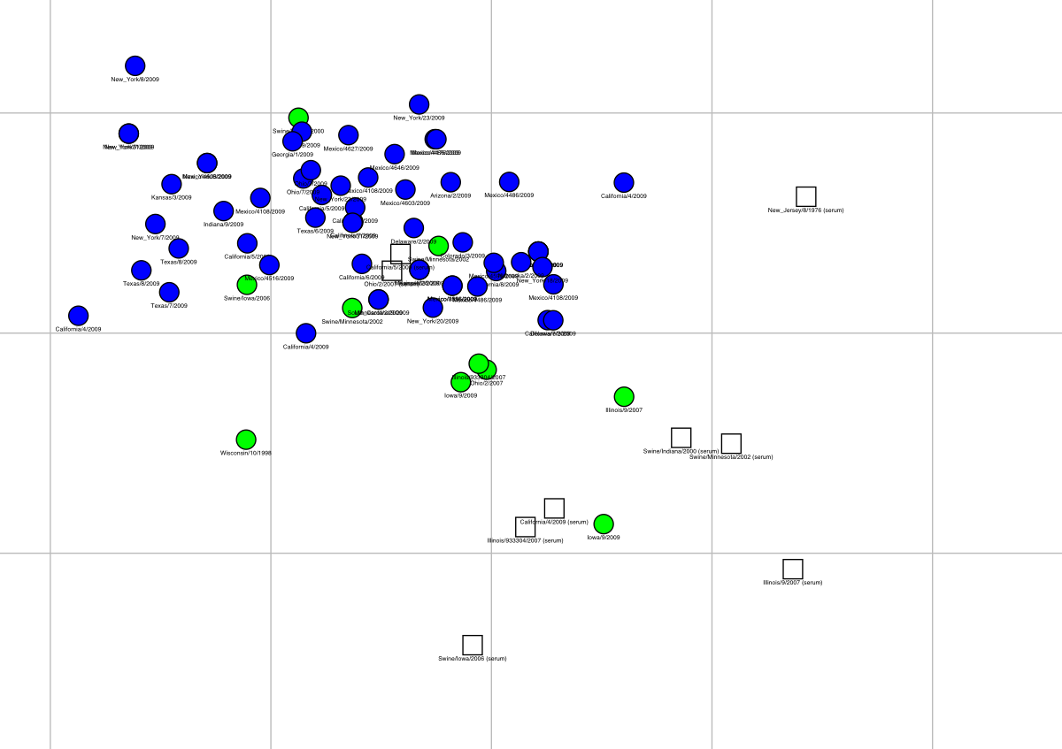
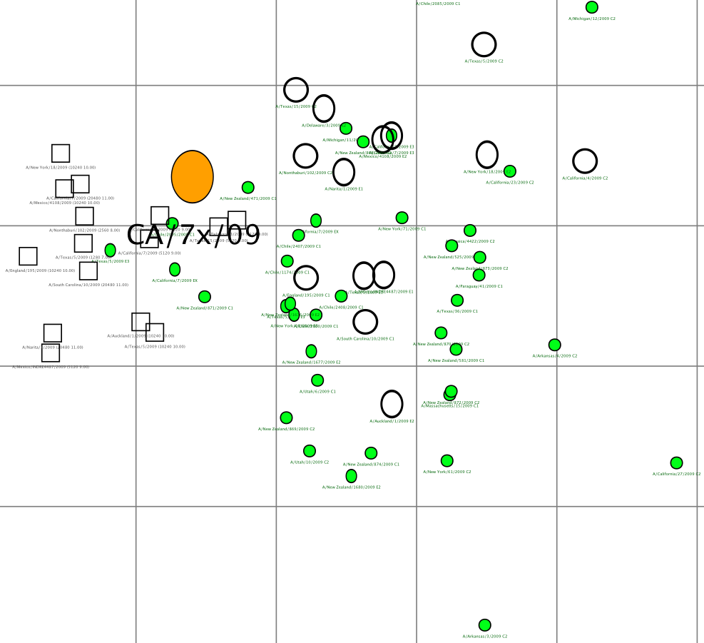
Antigenic map of 71 early swine-origin 2009 A(H1N1) influenza viruses and 11 antisera.

An antigenic map is a geometric
representation of HI assay data. In such a map, the relative positions
of strains (colored circles) and antisera (uncolored squares) are
adjusted such that the distances between strains and antisera in the
map represent the corresponding HI measurements with the least error.
Distance in the map thus represents antigenic distance and the closer
antigens are to each other in the map the more similar they are
antigenically.
The color of a circle in the map indicates whether
the strain is a 2009 A(H1N1) influenza virus (blue) or an A(H1) swine
influenza virus isolated between 1998 and 2007 from either a swine or
a human infected with a swine influenza virus (green). The vertical
and horizontal axes both represent antigenic distance, and because
only the relative positions of antigens and antisera can be
determined, the orientation of the map within these axes is free (thus
an antigenic map can be rotated in the same way that a geographic map
can be rotated). The spacing between grid lines is one unit of
antigenic distance -- corresponding to a 2-fold dilution of antiserum in
the HI assay. Two units correspond to 4-fold dilution, three units to
8-fold dilution, etc. A difference higher than 4-fold in HI titer is
usually considered to be sufficient to necessitate an update of the
human seasonal influenza virus vaccine. Antigenic clusters of human
seasonal influenza viruses typically have a radius of 2 antigenic
units (4-fold in HI).
Click on the image above to download a zoomable PDF and be able to view names clearly.
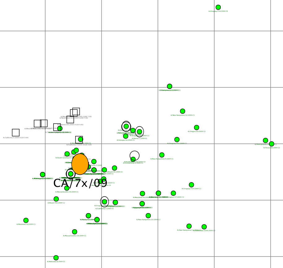
CDC H1N1pdm 2009-06-12

CDC H1N1pdm 2009-07-08

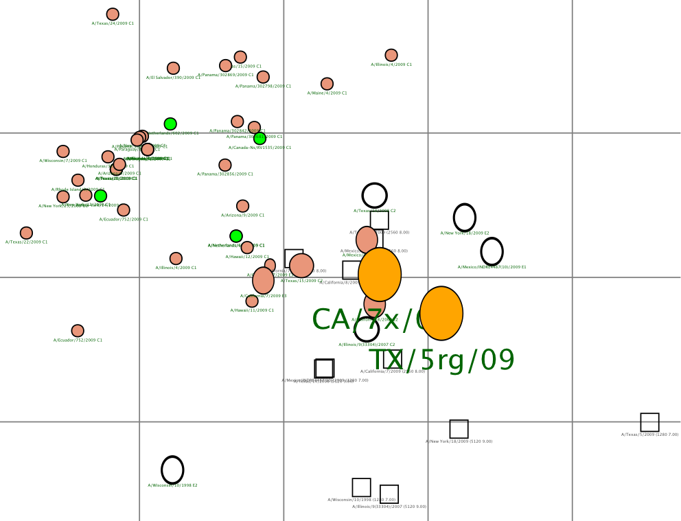
CDC H1N1pdm 2009-07-15

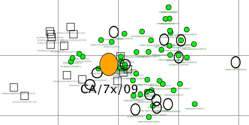
CDC H1N1pdm 2009-08-21
